I recently stumbled over R, a programming language for data analysis. R is open-source and available on all major platforms (Windows, Linux, Mac).
This post is about how to display (draw) a mathematical function with R.
There’s a very nice and interactive tutorial for R available over at codeschool.com. It’s free and takes about 3 - 4 hours to complete.
To draw a function, use the built-in function curve().
Let’s start with something simple:
curve(x^2)
This will plot the function x² and will look like this:
 Curve x²
Since we didn’t specify any boundaries for the x and y axes, R used 0..1 for the x axis and chose the y axis to fit.
Of course, we can manually specify the range for the values on the x axis:
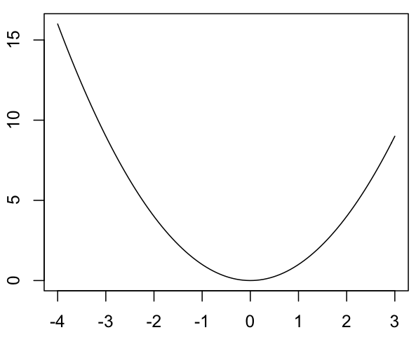
curve(x^2, -4, 3)
This will plot x² with -4..3:
 Curve x² - x axis: -4 to 3
As you can see in this plot, R makes the y axis match the required value range (here: 0..15).
Sometimes, however, this may not be desired. There are two ways to fix this.
First, you can specify the aspect ratio to be 1 (cause log scales are for quitters). In this case, the x and the y axes will use the same scale:
curve(x^2, -4, 3, asp=1)
will give us:
 Curve x² - same scale on x and y axis
The other option is to explicitly specify the range for the y axis by using the ylim parameter:
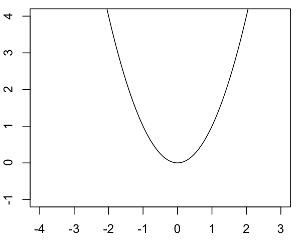
curve(x^2, -4, 3, ylim=range(c(-1, 4)))
will give us a y axis range of -1..4:
 Curve x² - y axis: -1 to 4
For more information on curve(), just type ?curve in R’s prompt.